Wednesday 29 September 2010

Review-Parasites!-Edward Ross, Jamie Hall, Rachel Morris


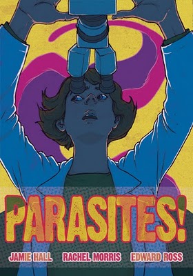
The first thing that strikes me about Edward Ross's and Jamie Hall's lusciously produced mini comic Parasites is the cover. Drawn by Rachel Morris (along with the back cover scientific diagram) the cover is slightly psychedelic and evokes old B-movies and sci-fi, with the outline of a parasite lurking menacingly in the background like some alien creature ready to strike. But the whole point of this comic is that parasites and parasitic diseases are not things of fiction and bad 50's B-movies, but are very much real especially to the large numbers of our population living in underdeveloped countries and tropical climates. This comic then manages to be both an educational aide (I can easily imagine it being used in GCSE science classrooms) and a humanitarian effort. It isn't preachy, it doesn't ask us for our money, but it does cause us to think and highlights a simple injustice in the world (the business drive behind creating and distributing medicine). This very short comic was written by a friend of the artist Jamie Hall who wanted to raise awareness of the research that was being done by Wellcome Trust Centre for Molecular Parasitology in Glasgow. It was promoted during the Glasgow West End Festival using a giant trypanosome float in the festival parade (which would have been an arousing sight for all scientific types out there). The comic itself avoids a lot of the usual educational cartoon cliches such as parasites with evil faces and superhero doctors in favour of the actual voices and faces of those working for the Welcome Trust. There are of course comic style visual devices to make the comic visually appealing but these are kept to a minimum so not to distract us totally from the importance of the words. A rain of parasites over an African skyline and a parasite playing a game of jenga against a researcher are enough to symbolise certain struggles trying to fight these diseases. The language itself is too overcomplicated, of course it will certainly pass over young children's heads, but as I mentioned earlier, a GCSE class should have little problem with this comic, and it does them a favour by not trying to patronise them either. I did notice however that a lot of the important words and phrases are highlighted in bold perhaps for impact or maybe to make them easier to read. As for the artwork, I'm sad to say that in this instance the artwork takes a backseat, not because it is bad (I have been looking at Edward Ross's preview for the next issue of Solipsistic Pop and it looks great) but perhaps because it is here to serve a purpose. In medical comics that are more about personal experience rather than reciting facts and trying to gain support, the artwork becomes more a part of the experience itself, reflecting it, distorting it, symbolising it (two obvious examples of this would be David B's Epileptic and Frank Stack's art for Harvey Pekar's Our Cancer Year). Of course I am not saying that reciting facts is a bad thing, I do feel that the more personal approach can be superior because it encourages empathy from the reader but in this instance I think the ultimate achievement is perhaps the subtle humanitarian aspect that I discussed later. One of the researchers voices the fact the work they do is 'interesting and important even if it's not financially profitable' we get the whole point neatly summed up. Medicines shouldn't be about profit, it should be about saving people's lives. This comic is free because it is funded by the Welcome Trust. They want this information to be free, they don't expect anything in return (I better be careful or I'll get all Karl Marx/hippy commune).
To summarise: I've always thought that comics have great educational potential and it's great to see (especially with the rise of Graphic Medicine) that the world of health care is really catching on. As this is one the first (to my knowledge) comic books of non-fiction produced by a medical professional and an artist I can only hope for more like this in the future.
If you would like a copy you can email Edward Ross at edward.m.a.ross@btinternet.com and for more information on the project got to Edward Ross's blog here or the Wellcome Trust here.

Tuesday 28 September 2010

Find of the week: Spumco Comic Book


I picked this up from Orbital Comics in London for a measly £2.50. Illustrated by Jim Smith, this is a comic book off shoot of the fantastically twisted animated series Ren and Stimpy. Named after Ren and Stimpy creator John Kricfalusi's own animation house, the comic mimics Kricfalusi's iconic style to the tee and features two of his lesser known (but equally hilarious) charecters George Liquor and Jimmy the Idiot Boy. The comic is short but sweet, big, colourful, and offensive, all of which make it appealing for children and adults alike. Kricfalusi with his Ren and Stimpy cartoons managed to combine his fanboy love and admiration for the classic animation of the Fleischer Brothers, Chuck Avery, and Disney(*1), with more than a hint of the grotesque and the out and out creepy. This resulted in many of the episodes of the show being banned (although thankfully these banned episodes are available on the DVD boxsets). I have to admit that I didn't get Ren and Stimpy when I was younger, I found it crude, and thought it was simply toilet humour and violence. It seems strange that my appreciation for it would be rekindled as an adult precisely when I'm not supposed to find those kind of things funny. But that is because I understand there is actually more to Ren and Stimpy than that: the hints at satire, and the mix match of 50's values and kitsch with a psychotic, unnerving, and surrealist edge made it unlike any other children's cartoon out there, and the shocking fact was that this cartoon was aimed at children. But children want violence and children want weirdness, and the very fact that the children were being given what they want back then must have been refreshing. But now that we live in an age where all our children's programmes are done in CG, and are all too glossy, shiny, happy, with annoying songs and voices, and overtly PC (*2), I know what kind of programme I'd rather my (imaginary) children were watching.
Anyway, I've noticed I've made a major digression there. The comic itself will make you laugh. The existence of the Idiot Boy in cartoons doesn't seem as possible in this day and age but the staggered punchline concerning him evading potential trouble at every turn simply because he's a 'cute little moron' is pleasant enough. The star of the strip however has to be George Liquor. His strip is written in classic Ren and Stimpy style with great back and forth dialouge between George and the Dirty Mouth Bass and a great tounge in cheek pay off at the end. Every panel is animated, you can hear the sound effects and the music, even sense the comic pauses, it reads just like the Ren and Stimpy show in your head. This neat little package is wrapped up with a great advertisement for Spumco toys in which 'the great nations' (of the USA and China) 'have temporarily buried their differences for the good of Spumco'. Check out Spumco.


------------------------------------------------------------------------------------------------
(*1) Which you can see if you look at John K's Blog here.
(*2) There is obviously good 'safe' children's TV out there. Sesame Street is an obvious example of multi-culturalism that doesn't seem like it's trying to hard and benefits from Jim Henson and cool animation.

Friday 17 September 2010

You did what to my comics?!

Isaac Brynjegard-Bialik has made an art show out of every comic geeks worse nightmare, the destruction of their prize Marvels. He has made collages/paintings from the panels of Marvel comics such as The Incredible Hulk, The Sub-Mariner, Green Lantern, and The Fantastic Four.


Unfortunately it's in Santa Carlita in California, but it's a nice idea.
Check out his art blog here.

Thursday 16 September 2010

Review: Japan as viewed by 17 creators-Various artists (edited by Frederic Boilet)

This cross-cultural anthology is something of a gem. Imagine this for a dream assignment: Hello (insert your name here) how would you like to come to Japan to work on an anthology comic with sixteen other talented artists from Japan and France? Oh, and we'll pay all your travel and accommodation expenses too. As my flatmate sometimes says, 'I would sell my mother to the Arabs' for an opportunity like this. So what better way to live out your fantasies vicariously then by buying this anthology which features the cream of the crop when it comes to both the French and the Japanese alternative comic gene pool. This isn't a straight love letter to Japan, it's an anthology about culture shock, tradition, mythology, commercialism, and prejudice to name but a few things.
The connection between France and Japan is that France's love of comics meant that they embraced Manga with open arms meaning that France itself has a quite successful and extremely diverse Manga market. Perhaps because of the French's belief in comics as an art form, more niche forms of Manga such as adult/dramatic Manga, and avant-garde Manga are much more popular there. The French editor of this anthology, Frederic Boilet, fell in love with Japan so much that he moved there in 1993 and has been there ever since.
The first great thing about this anthology is that it gives you the chance to read a lot of work by artists (particularly the French ones) who it is usually very difficult, or very expensive, to get any of their work in English. I'm thinking of Fabrice Neaud who I've wanted to read ever since I glimpsed a snippet of his work in Ann Miller's Reading Bande Dessinee, Nicolas de Crecy, Francois Shuiten & Benoit Peeters, and Joann Sfar's journal comics.
Each artist is sent to a different host city (chosen at random by the French Institute in Japan) and asked to write a story about the area. This story can be fact or fiction and although a lot of the artists tend to stick to a personal travelogue approach we are also treated to history, myth, fantasy, and science-fiction along the way. As with the best anthologies there is a huge array of visual styles here. Perhaps the most traditionally 'Manga-like' artist (despite his adult themes) is Jiro Taniguchi, although elsewhere we do get to see manga's influence on the French artists, as in Aurelia Aurita's use of Manga style emotive iconography. Nicolas de Cercy's story is drawn in a style which manages to be frantic and scribbled yet at the same time clear, playfully explores the outlandish graphic design of Japanese products and presents us with a pretty satisfying twist to the story which will make you smile. Another highlight from the French quarter is Shuiten and Peeter's story-come-tourist brochure which showcases futuristic architecture, dizzying perspective, and a loving nod to the Japanese love of giant B movie insects. Out of the Japanese artists my favourite stories would have to be by Daisuke Igarashi who manages to combine fast paced action (being careful not to make his motion likes OTT like a lot of mainstream Manga artists) with unsettling surrealism, and alternative Manga golden boy Taiyo Matsumoto's(*1) traditional style folktale which evokes very early Manga and Eastern art while style maintaining his own idiosyncratic style. The use of single page panels also gives it the feel of a very Zen children's picture book.


It is Fabrice Neaud's entry to this anthology however that gives us the most scathing critique of Japanese culture. I read somewhere that Neud's journals are very clever because they manage to channel his personal experiences into a kind of mirror to society, his journal's although personal, are somehow political. In this entry it is Neaud's identity as a gay man that brings him to question the attitude towards homosexuality in the East. In his quest, the homosexual Asians are an invisible people, and although prejudice is not spoken of but it is clearly there. The topic of homosexuality comes up again briefly in Sfarr's journal entry when he sees what he thinks is an advert for a gay magazine in the Tokyo subway, only to find that it is in fact advertising porn manga for girls (apparently the gay male is a big female fantasy over there).
All in all this anthology is not just a reflection of the weird and wonderful Japan we hold up as alien to our own culture (love hotels, Harajuko girls, girl's underwear in vending machines) but of a very personal Japan to each artist. Do the artists in this anthology suffer from their own bouts of Orientalism or are they cynical and aware? I think capturing the excitement of being in a new culture and a new environment is an important thing and if an artist is successful in their storytelling we can feel this with them, and then later on their disappointments, their laughter, is also ours.
When I went to Tokyo three years ago I bought into the stereotype that Japanese people will often feign ignorance because they don't want to be asked questions by Westerners(*2), in this anthologies last story we meet a Japanese man who proves me wrong, warmly welcoming the French artist and showing him the sights, yet having a strange spirituality, an affinity with nature that gives this anthology a poignant and punchy end.
-----------------------------------------------------------------------------------------------
(*1) Author/artist of Go Go Monster, No 5, Blue Springs, and most famously Tekkon Kinkreet: Black and White
(*2) I since felt stupid, realising that most people on the tube in London don't exactly talk to one another.

Book cover of the week

To make up for the abscence of this entry last week here's two fantastic covers from Penguin/Pelican. I've always had a bit of a thing for the old Pelican blue series, that tended to cover a wide range of educational topics such as mathematics, sociology, psychology, and architecture. There's something about the way this series is designed that makes the name of the author almost irrelevant in relation to the overriding theme of the book. There is never too much going on on these covers, they use a lot of nice black and white photography and capture the spirit of the time pretty well. Lovely bold and simple font, and a great juxtaposition on the over on the Mythology anthology between ancient myths and modern day ones.

Tuesday 14 September 2010

Joann Sfar's Gainsbourg sketches

French comics writer and artist who has had a close collaboration with such French luminaries as Lewis Trondhiem (most notably on the Dungeon series) , Christopher Blain, Emmanuel Guilbert, and David B as well as his own solo work, took a turn on the director's chair with his debut biopic Gainsbourg last year. No ordinary biopic this is in fact based on a graphic novel by lifelong Gainsbourg fan Sfar. I am yet to see the film but it is meant to be expressionistic, surreal, and uses an actor from the Spanish SPX house behind Pan's Labyrinth. These sketches and little comics by Sfar look great, and are available in book form, although sadly only in French.

In other Sfar related news, an animated adaptation of his graphic novel The Rabbi's Cat(*1) directed by him, is currently in post production, due for release in 2011.

And for some Serge/Bardot 'Comic Strip' action, click here.

One final link: the fantastic blog Draw Serge.

-------------------------------------------------------------------------------------------------
(*1) In which a Rabbi's cat swallows the family parrot and can suddenly talk as a result, insisting with his new found voice to be converted to Judaism.

Ah Pook Is Here


I've never been a huge fan of William S Burroughs, finding his cut-up technique of writing a little irritating and overrated, however with the impending release of a once abandoned graphic novel collaboration between himself ,and the artist Malcolm McNeil, I may be forced to reevaluate.
Started in the 70's and originally appearing as a comic strip under the title The Unspeakable Mr Hart in English magazine Cyclops, Ah Pook Is Here, and after seven years of struggles(*1) they finally got the book published in 1979. The idea of a book lenght comic strip, predating Eisner's invention of the term 'graphic novel' (with what is argued(*2) is the first graphic novel, A Contract With God) was a daring move.
It is Fantagraphics Books that will be releasing a restored edition in the summer of 2011. It will be released as a two part book the second part being the artist's own memoir of his working relationship with Burroughs.
Whether or not the text will make me see Burroughs in a different light remains to be seen(*2). However one thing can be said for him is that he certainly has an eye for artistic talent, his only other comics based project that never came to fruition was a science-fiction strip for the dream anthology that never was, Someday funnies(*3)
I can only image how much of a visual delight the full colour reprint of this is going to be just from the samples available on McNeil's website. Luscious horizontal panels of landscapes, stretching out and evolving into surreal masterpieces, reminiscent of Dali, classical religious artwork, William Blake, and Escher. Other sections of the book , which resemble more closely the comic book format, are sketched out in pencil and are atmospheric and brooding and taking a leaf from Will Eisner's book, make great use of negative spaces and well thought out panel composition.
If the samples presented to you here are not enough to keep you satisfied until the books release, then you always check out McNeil's site here and also a creepy slightly Tim Burtonesque(*4) short animation based on the Burrough's text (and voiced by the man himself) directed by Philip Hunt

-------------------------------------------------------------------------------------------------
(*1) Their original publisher closed
(*2) Although there are other contenders for that crown, Milt Gross's He Done Her Wrong and the early woodcut novels of Lynd Ward and
(*2) Judging by the plot (the usual paranoid conspiracy theory about the media/government with some sci-fi elements) I doubt it.
(*3) Which was to feature legends of the comics world as well as the non-comics world, including Steadman, Fellini, Dali, Tom Wolfe, and even Germaine Greer.

Thursday 9 September 2010

Comics and Architecture

An interesting article has been posted by The Hooded Utilitarian over at The Comics Journal describing in quite some detail the relationship between buildings and environment in a comic and the characters who inhabit them. The article mainly discusses Josh Simmon's new wordless graphic novel House, but he also briefly skims over Chris Ware, Seth, David Mazzucchelli, Marshall Rogers, Will Eisner, Richard McGuire, Tom Gauld, and François Schuiten and Benoît Peeters. Well worth a read. Click here.

Tuesday 7 September 2010

Review: National Lampoon presents: Claire Bretecher

Looking on Amazon it seems pretty hard to find any English language collections of French cartoonist Claire Bretecher's work but by looking at her entries on Wikipedia and Lambiek Comiclopedia it is clear that she is pretty revered in her country, and indeed amongst most comics aficionados. But at the time she started getting recognised (70's) she was sadly one of the few women making it big in the European comics scene. She got her big break doing some illustration work for Rene Goscinny and in 1972 she founded the comics magazine L'Echo des savanes with Gotlib and Mandryka.
So having heard her name floating around I picked up a second hand copy of a collection of her cartoons put out by the American humour magazine National Lampoon. Despite the fact that the large majority of her strips focus on gender issues and feature mainly female protagonists, they are portrayed fairly neutrally, as Bretecher herself explains in the books introduction:

'Women in comic strips are usually portrayed either as shrews or movie stars. But in real life, women, like men, are neither of these extremes, so I portray women and men alike, except that the women have two little round things on their chest'

This comes as a refreshing antidote to the reinforcement of female stereotypes in comics of that period especially the newspaper strip Cathy by Cathy Guisewite which has been parodied to death over the years.


Stylistically and thematically Bretecher reminds me slightly of Jules Feiffer in her dealings with the pretensions of the intellectual and bohemian elite. Whether mocking parents new found obsession with Freud, lampooning film critics, or poking holes in the commitment of the anti-consumerist crowd Bretecher's humour is as relevant now as it was back then. The sign of a true feminist in my eyes is someone who champions equality not superiority and I can safely say Bretecher follows this blueprint to the tee, not being afraid to make a mockery of the feminists as well as shooting down the chauvinists with her razor sharp wit. Most of the strips carry a subtle slightly absurdist message reminding us never to take ourselves too seriously, but from some of the strips its easy to see where her sympathies lie (a strip about abortion managing to make a poignant joke about women's choice in the matter). Overall this is a nice introduction to Bretecher's work and I for one would like to see more of it made available, especially her colour work and her teenage character Agrippine.

Kayne West's New Yorker Tweets

What do you get when you cross Kayne West's egotistical, often off the wall and grandiose twitter tweets with cartoons from The New Yorker?


Fantastically fitting captions is the answer. Even the Jesus Christ of Hip Pop approves.
Click here to view them all.

Publisher Spotlight: Self Made Hero

Self Made Hero are another London based independent comics publisher established in 2007. The thing that makes Self Made Hero stand out from other independent publishers in London is their central focus on bringing us the best graphic adaptations of the best literary work. They split their releases into themed series including Manga Shakespeare, Eye Classics, Crime Classics, and Graphic Biography. Their Eye Classics series has established comic artists such as Martin Rowson, and Andrzej Klimowski , as well as relative newcomer Catherine Anyango tackle Laurence Sterne Mikhail Bulgakov, and Joseph Conrad. These aren't just straightforward adaptations either, each artist is given license to add postmodern twists and even their own jokes.
Perhaps their most well received release however, was the Johnny Cash biography by Reinhard Kleist entitled I See A Darkness. This is a biography that will probably attract even those who aren't really the biggest fans of Cash's music. Visually it taps into the dark underbelly of Cash's life with it's noir style use of black and white and occasional surreal elements.
Also coming soon in this series is Gonzo: A Graphic Biography of Hunter S Thompson and Dance By The Light of The Moon by Judith Vanistendael, the first biography published by Self Made Hero about someone who isn't really famous. Dance By The Light of The Moon is a semi-autobiographical story inspired by the authors love affair with a political refugee from Togo, beautifully rendered in lush brush strokes reminiscent of Craig Thompson's Blankets.
Finally Self Made Hero have just started to branch out into gift books based on comic book charecters and will be releasing several Moomins inspired books including a Moomins cook book!
Self Made Hero's reputation is deservedly growing and hopeful with continue to do so, Anyango's adaptation of Heart of Darkness is the latest of their releases to be heaped with praise.
Check out their website here.

Monday 6 September 2010

Find of the week: Oh, Brother!


Oh, Brother! is a daily webcomic created by cartoonists Bob Weber Jr and Jay Stephens. It is drawn in a format reminiscent of the classic newspaper strips (Calvin and Hobbes, Peanuts etc) but the action is usually confined to a minimum number of panels leading up to a punchline rather than a full story followed by a punchline. Oh, Brother! draws from plenty of current pop culture phenomena such as reality TV, blogging, and eBay but at the root of this comic lies the classic brother sister love-hate relationship which I'm sure anyone with an older or younger sibling can relate to. There are brief moments where the characters of Bud and Lily act as ventriloquists for distinctly adult thoughts and actions (think Richard Thompson's Cul De Sac), but mostly the humour resolves a kind of 'Kids say the funniest things' vein which gives the the humour a two sided aspect, one that both the parents and the children can enjoy.


Visually the block colouring and the simple yet iconic character design give this strip a distinctly Cartoon Network feel (Dexter's Laboratory, My Fairy Godparents etc). There is also a very subtle use of movement and expression in the strip which changes only slightly with each image therefore adding extra weight to the punchline.

Click here to go to the site.

Friday 3 September 2010

Comica Festival 2010: Trina Robbins and Roger Sabin

Copied directly from the Comica site incase you miss it are two forthcoming events that have got me very excited indeed:


Comica & Laydeez Do Comics Present: Trina Robbins

For the first time, Comica Festival and Laydeez Do Comics are thrilled to be teaming up to invite to London the important comic artist and writer, from the seminal underground comix of the Seventies to such icons as Wonder Woman, Barbie, Powerpuff Girls and her own GoGirl!, lecturer, curator and America’s foremost comics ‘herstorian’, Trina Robbins. She is coming over to present a paper at the academic conference Motherhoods, Markets, and Consumption at the Saïd Business School at the University of Oxford on Monday 13 September and has kindly agreed to visit London for this special extra event on Tuesday 21 September.

Ms. Robbins will present a lively and provocative illustrated lecture entitled: HERE ARE THE GREAT WOMEN COMIC ARTISTS, in which she introduces a whole slew of brilliant and talented women cartoonists from the early 20th century who are not included in histories and major exhibits by men, and explains why. Among others, she will be speaking about Nell Brinkley, the proto-feminist whose sumptuous portrayals of women inspired Mae West’s screen persona, as collected in the acclaimed deluxe edition from Fantagraphics, The Brinkley Girls. Her earlier biography of Brinkley was reviewed by Comica Festival director Paul Gravett here. She has also just written the introduction to Fantagraphics’ first edition of Moto Hagio’s historic shojo or girls’ manga entitled A Drunken Dream & Other Stories.

Doors open at 6.30pm and Trina Robbins will be speaking from 7pm. Following this, there will be an informal discussion and Q&A session and conclude by 9.30pm after a book signing and refreshments. The evening will be held at the regular venue for Laydeez Do Comics, The Rag Factory , 16-18 Heneage Street, London E1 5LJ. For directions: Nearest Tube: Aldgate East. Follow the exit which directs you to the Whitechapel Art Gallery. Turn LEFT out of the tube into Whitechapel High Street. Take the first left into Osborne Street and carry straight on into Brick Lane. Take the fourth turning on the right into Heneage Street and The Rag Factory is a little way up, on the right.

Don’t miss this rare opportunity to hear and meet a pre-eminent figure in contemporary American comic books, graphic novels and comics studies. To help cover costs, there will be a modest charge of £5 for a ticket, which you can pay on the door on the night. As we expect a lot of interest and places are limited, you can reserve your tickets by emailing Nicola Streeten at: info@laydeezdocomics.com. Sarah Lightman and Nicola Streeten from Laydeez Do Comics and Paul Gravett from Comica Festival look forward to welcoming you on Tuesday 21 September for a truly memorable evening.

Comica 2010 Festival opens with Free Exhibition, Symposium & Comiket

Here’s the first news about this year’s exciting edition of Comica, the London International Comics Festival, back for its 7th annual season. A major new element will be a three-month exhibition curated by Comica director Paul Gravett entitled ‘That’s Novel : Graphic Novels Now’ which will celebrate current innovations in the comics medium in Britain and internationally, both on and off the page. This evolving show will be held at The London Print Studio Gallery and tap into their amazing printing facilities, from etching and lithography to silkscreening and the latest digital methods, to offer invited artists the chance to work on special new works and in media they may never have tried before. Admission to the exhibition will be free and a variety of talks, panels, workshops, masterclasses and more will also be taking place at the Gallery.

To kick off Comica 2010, the festival is collaborating with The School of Arts at Birkbeck, University of London, in association with the British journals Studies in Comics, Journal of Graphic Novels and Comics and European Comic Art, to hold a one-day Comica Symposium on Friday 5 November in a 180-seater conference room shown below. Entitled ‘Transitions’, this will promote multi-disciplinary research of comics and graphic novels, manga, bande dessinée, webcomics and other forms of sequential art.

Rather than being restricted by a specific theme, the aim of the symposium is to highlight research from postgraduate research students and early career lecturers bringing together different perspectives and methodologies, whether cultural, historical, or formal, thereby mapping new trends and providing a space for dialogue and further collaboration to emerge. Dr Roger Sabin, Reader in Popular Culture at Central St. Martins and author of Adult Comics and Comics, Comix and Graphic Novels, will introduce the event and respond to the panel papers. Following the papers and response, there will be a roundtable discussion from artists/scholars who will reflect on the links between the two practices. Work will be on display throughout the event. Organised with Tony Venezia, the day will conclude with a wine reception. Details of how to register and participate will follow soon. And best of all, the whole event is free!

And Sunday 7 November brings the next Comica Comiket Independent Comics Fair, teaming up with the popular, long-running National Collectors Marketplace at the Royal National Hotel, Russell Square, and taking over the (Warren) Ellis Room from 12-5pm. A limited number of exhibitor tables will be available at affordable prices and there will be several special events and surprise guests throughout the afternoon. The public are admitted free. Booking arrangements for tables will be announced shortly, along with much more of the Comica 2010 Festival programme. Meanwhile, put these dates in your diary now and tell all your friends!


Considering this is just a taste of things to come, we can except an even better Comica Festival this year! Also if you haven't done so already, you should check out the Hypercomics exhibit running until the 26th of September at the Pumphouse Gallery in London's Battersea Park. Featuring boundary pushing work from the likes of Dave McKean, Adam Dant, and Warren Pleece, you check out the exhibitions mini site here for more info.


Thursday 2 September 2010

Blog of the week: Drawn!

Although the message at the top of the blog claims that the writers have gone on summer holiday, I have seen a sneaky post from the 1st of September, so it may be that they are back. Regardless of whether they are posting at present or not Drawn! is a brilliant blog about cartooning, illustration, comics, and animation, which has postdated countless short but sweet entries linking you to countless hidden gems. With more than a handful of talented contributors (including Jay Stephens whose kid comic Oh, Brother! I will be looking at a later date) and a fairly open submissions policy, Drawn! is well worth your time.

Review: Afrodisiac-Jim Rugg&Brian Maruca


What do you get if you mix the blacksplotation cinema of the 70's such as Superfly and Black Shampoo with 50's b-movie monsters, sci-fi, and the superhero and romance comics of yore? The answer lies in this fantastic pastiche come love letter, Afrodisiac. The character of Afrodisiac was born in Rugg and Maruca's ongoing series Street Angel about a 12 year old homeless kung foo fighting skateboarding prodigy.


This book is not a continuous flowing graphic novel, neither are the stories in anyway interconnected (in fact in each separate episode Afrodisiac's origin story is different). This is a post modern artifact, a found object, a mish-mash of styles, fast-paced, action-packed, and pretty absurd. Images are cropped, cut-out and resized, giving this book a distinct scrapbook feel (see also Al Columbia's Pim & Franchie). A variety of styles are adopted, from film noir moody shadows and almost Hanna Barbaraesque cartoonishness , to big eyed anime antics and aging pulp comic effects(*1). The book is full of great little touches such as fake comic covers, letters pages, and coupons to send away. As well as this there is a moment when you have to flip the book on it's side in order to read the story properly, and a deja vu storyline where the payoff of the strip shows Afrodisiac break out into the blank white plain to meet a scantily clad death.
When Rugg and Maruca parody these shadows from popular cultures forgotten vaults it is refreshing to get the feeling, the enjoyment that they got from these things, rather than them falling back on the tried and tested 'enjoying it ironically' angle (e.g. it's so bad it's good).
You know what they say, 'One man's trash is another man's treasure'. This book may be escapist nonsense, but it's escapist nonsense par excellence.


-------------------------------------------------------------------------------------------------
(*1)
This is a similar style aged comic effect that Daniel Clowes uses in some of his comics such as David Boring and Eightball, and looking at the design of some of his characters (his villains in particular) you can see a slight affinity between Clowes and Rugg

Wednesday 1 September 2010

Book cover of the week

Found this in Scarthin Books in Derbyshire (well worth a look if you're round that way). Haven't read the book but Steadman seems to have got the cover right judging by the blurb:

'Here amongst thirty tons of confiscated white paper lives a squat, monstrously endowed customs officer of sixty, Roman Wachholder. Up on the hill in a hygienic, sound-proof house lives his friend and mortal enemy, Ossias Wurz. While the valetudinarian Wurz spends his days systematically cleaning, disinfecting and redecorating his house, the earthly, guilt-ridden Wachholder spends his crazily concocting poison-pen letters to drive him out of it'.

Darkly humorous, surreal, existentialist nonsense meets it's match in Steadman's erratic and instantly recognisable linework.

Review: In The Night Kitchen-Maurice Sendak

Sendak gives more than a passing nod to Windsor McCay in this, the second book in his famous Wild Things trilogy. The first image on the opening page of this short but sweet tale is a heartfelt tribute to the familiar starting point of McCay's Little Nemo in Slumberland strip from the early 1900's (see below).

Rather than going with the usual picture book format here he has broken down the story into comic book panels which vary greatly in shape and size (although all are bigger than your average comic book panel). The only image that successfully escapes the rigid confines of the comics panel is a double page spread which perfectly follows on from a stuttered set of panels depicting Mickey's climb in the plane made out of dough, the succession of images occur in such a way, that when we are given the full view of the scene, it seems as if Mickey has literally broken the forth wall of the comics panel and come zooming out into the open.

The book tells the very simple story of Mickey who is rudely awakened in the night by the sound of The Night Kitchen. Falling into this kitchen (a beautifully coloured cityscape of kitchen utensils and condiments) he almost gets baked into a cake by three cheerful looking fat bakers, but escapes. Having ruined their cake he proceeds to help them make a new one before returning to bed. A pretty nonsense affair, but some of the best children's books are. My mum labelled this 'too weird' for my nephew (he is only two) so I staked a claim for it myself.

In comparison to Where The Wild Things Are Sendak's artwork is bolder and more cartoon like, the shading and colouring is less intense, and there is less of a feel of texture to the characters in this book. In other words the images are less like illustration and more a part of the story. Sendak is obviously a natural when it comes to the conventions of the humble comic book as his panels flow without the slightest hiccup, yet at the same time the wonderful over-sized lettering (especially when Mickey crows from on top of the milk bottle) remind us that this is indeed a children's book. The sing song rhythm of the words also mean that this will be perfect for reading aloud. A must have for children, or for your own inner child.
P.S There is an edition of this on the Internet that you can get which leaves out all of Sendak's colour work in order for your child to colour it in. This is the edition I intended to get for my nephew but because I bought it used, this wasn't the edition I got. D'oh.

P.S.S There is animated version of In The Night Kitchen as one of the DVD extras on the animated version of Where The Wild Things are. On of the animators responsible for this was none other than Gene Deitch, father of underground comix artist Kim Deitch famous for his work on Tom and Jerry amongst other things.